
READ Reading Data · January 2026 · ~4 min
The correlation heatmap: see who moves with whom
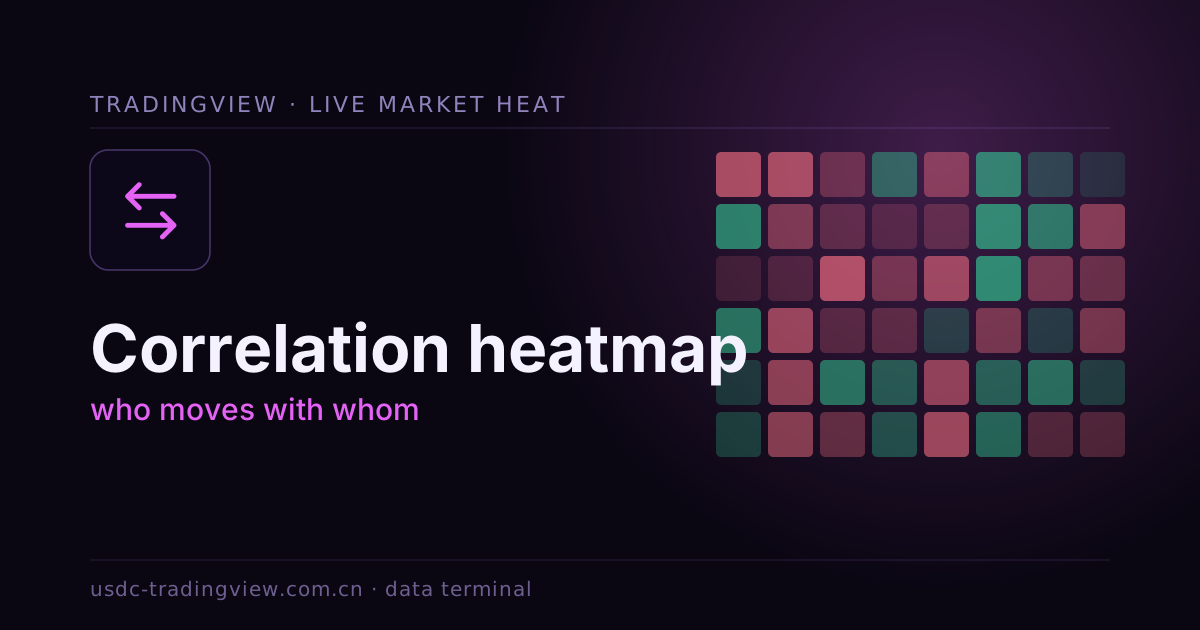
You think you hold ten unrelated instruments; you may hold ten copies of the same bet. A correlation heatmap makes this visible: a grid where each cell's color is the co-movement strength between two assets — dark is high correlation, pale is low.
How to read the grid
- The diagonal: an asset against itself, always maxed — that's your baseline;
- Blocks of dark: these move together, so holding them together does not spread risk;
- Negative (inverse color): one up, one down — the real hedge candidates.
One caveat
Correlation shifts with the environment; assets uncorrelated in calm can crash together in a crisis. So read the matrix dynamically — compute one per time window and compare how they change under stress.
Diversification only works if the baskets are truly independent.
Further: the same data from another angle — "who is stronger" rather than "who moves together" — see relative strength comparison.