
READ Reading Data · January 2026 · ~4 min
Reading a market heatmap: the whole field at a glance
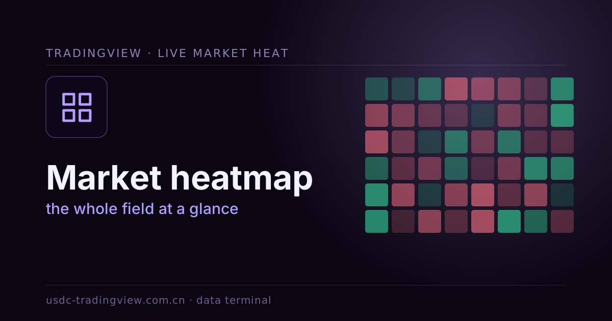
With hundreds of instruments, reading each chart one by one is exhausting. A heatmap compresses the whole market into one picture: tile size is weight (market cap / volume), tile color is change — green up, red down, deeper is stronger. One glance and the whole field's strength is in front of you.
Three dimensions at once
- Size: bigger tiles matter more — read them first to set the tone;
- Color: a sea of green or red makes sentiment instantly visible;
- Grouping: arranged by sector or asset class, whichever zone leads is obvious.
How to use it
A heatmap isn't for finding precise entries — it's for fast orientation: use it to lock onto today's strongest and weakest sectors, then drop into a specific instrument's candles for detail. It's a top-down way of looking — see the forest, then the trees.
A heatmap answers "where is the money flowing," not "will it tick up next second."
On the chart: the top of this page is a live heatmap demo, and TradingView ships crypto and stock heatmaps colored by market cap, change or volume. For flow between sectors, see the sector rotation map; to quantify advancers and decliners, see market breadth.